Two common types of head-mounts for VR headsets dominate the market today: the side & top strap approach, and the halo approach (which rests mostly on the forehead). Despite their abundance, there’s still a long way to go toward improving comfort, ease-of-use, and social acceptability as VR grows. Designers from industrial design firm Nonobject prototyped a range of new designs which could be viable as VR technology becomes smaller and lighter.
Nonobject shared the prototypes with Fast Company Design, which included both headset and input concepts. The company actually built many of the designs to test the fit for real. Even though it is claimed that they can “accommodate the Oculus spec” (presumably the weight and size requirements of the Rift) some of the designs seem like they could only work with lighter components than we have in VR headsets today, and none of the designs appear to account for the weight of the cable which, as I found in my review of the Acer Windows VR Headset, can be an issue for certain types of head-mounts. Alas, it’s a neat look at a potential direction for the future of VR headset design.
Kepi
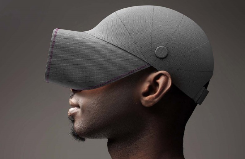
The first design is called Kepi, and aims to bring both familiarity and comfort to a VR headset. The design essentially fuses a baseball cap and a headset into one. That’s got the benefit of being recognizable and understandable—everyone knows how to put on and fit a baseball hat.

What’s especially interesting about this design is that it uses the surface area of the entire head for both friction (to keep the headset on your head) and weight distribution, rather than relegating it to smaller areas and causing greater pressure from straps or the forehead-heavy halo designs. Like the other designs from Nonobject, unfortunately Kepi lacks integrated audio, which I feel is essential for making VR headsets as hassle-free as possible.
Split
Another approach is the Split, which functions just as the name implies—by splitting the headset down the middle of the visor so it can come on and off with a tug. This would of course present major challenges to the internal component design, but should at least be hypothetically possible as many headsets today are using one display per eye rather than a single panel across both eyes. Fast Company Design suggests a latch might be employed to ensure the magnetic connection doesn’t separate in the midst of more intense VR sessions.
One neat part about the Split design is that it can easily go from being on your head to resting around your neck. With the first generation of VR headsets like the Rift and Vive, if you need to take the headset off to interact with the real world briefly you’re either stuck with it uncomfortably resting on your forehead, in your hands, or you have to set it down completely. Even with newer devices like the Windows VR headsets, the flip-up functionality is a nice step forward, but can still be a little awkward if you’re going to be out of VR for a few minutes but don’t want take the headset completely off. One potential flaw with the Split is that it might be annoying to split and re-attach the headset with controllers in your hands.
Grasp
The design firm also considered an approach for VR controllers, resulting in a device that looks a lot like a combination of Oculus Touch and Valve’s Knuckles controllers, and uses a fabric cinch to keep the controller against the user’s hands so that they can ‘let go’ of the controller during use. The idea is to instill a more natural feeling of not holding anything in your hands while idle, but retaining the feeling of an inanimate object in your hands when you grab something in the virtual world.
Stone

One of the most interesting prototype designs is the ‘Stone’ toolset. The duo of devices are envisioned as a foundation for creative VR input, with the stylus for drawing and writing in one hand, and the stone-shaped device for sculpting, scraping, carving, and cutting with the other. I imagine the surface of the stone would also make a great touchpad for finer abstract input, like dialing in brush sizes, scrolling web pages, and adjusting colors using your thumb.
Of course, there’s a whole lot of technology that would need to be figured out to make the Stone devices actually work, but if someone could manage it, the stylus could answer an important need that VR is lacking right now: efficient text input, which is being approached from several angles at present.
This article was originally published by ROADTOVR.

